By Michael Ellis
•
June 8, 2026
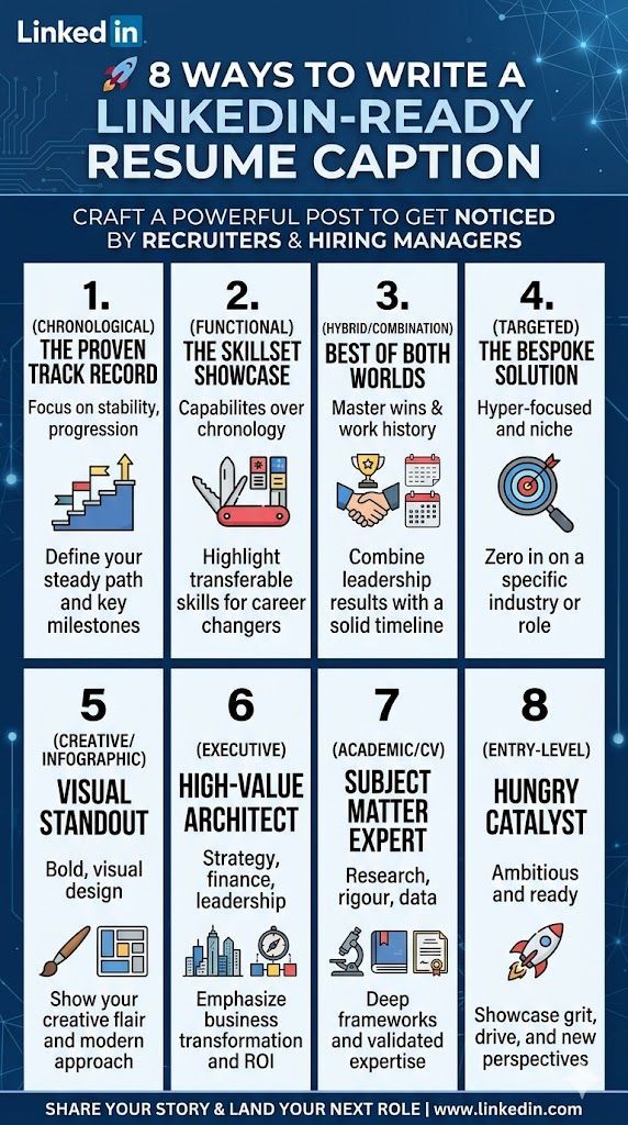
Here are 8 distinct LinkedIn captions tailored to different types of resumes, designed to grab attention, showcase specific value, and drive engagement from recruiters and hiring managers. 1. The Chronological Resume (The Proven Track Record) Best for: Professionals with a steady, upward trajectory in a single industry. Tone: Confident, structured, and authoritative. Headline: 10 years of experience doesn’t just mean time on the clock—it means a playbook of proven results. 💼 My entire career has been built on a simple premise: leave every department, project, and revenue line better than I found it. From my early days execution-focused to my recent years leading strategy, my career trajectory has been a steady climb of increasing responsibility and measurable impact. I’ve compiled my complete, step-by-step professional journey into an updated resume. 👇 Inside, you’ll find: The exact progression of my leadership roles. Key milestones (including how I helped scale [X] project by [Y]%). A consistent history of operational excellence. If you’re looking for a seasoned professional who knows how to navigate industry shifts and deliver consistent ROI, let’s connect. #CareerGrowth #Professionals #Hiring #Leadership #[YourIndustry] 2. The Functional Resume (The Skillset Showcase) Best for: Career changers, professionals with employment gaps, or those with highly diverse backgrounds. Tone: Results-oriented, versatile, and strategic. Headline: Capabilities > Chronology. Here is exactly what I bring to the table. 🛠️ Sometimes, a traditional timeline doesn't tell the whole story. My value isn't locked into a single job title; it lives in a deeply versatile, battle-tested skillset that translates directly into business growth. Instead of just listing where I’ve sat, my latest resume focuses on what I can actually build, fix, and optimize for your team. 🔥 My Core Pillars of Expertise: [Skill 1, e.g., Conversion Rate Optimization]: Proven to drive [X]% increases. [Skill 2, e.g., Cross-Functional Leadership]: Managed diverse teams across multiple high-stakes projects. [Skill 3, e.g., Data-Driven Architecture]: Designing systems that cut inefficiencies. If your team needs a specialized problem-solver who can hit the ground running on day one—regardless of the industry—take a look at my skillset breakdown below. Let’s talk! #Skillset #ProblemSolver #CareerTransition #Versatility #Hiring 3. The Hybrid / Combination Resume (The Best of Both Worlds) Best for: Senior professionals and specialists who want to highlight massive wins alongside a strong career timeline. Tone: High-energy, elite, and metrics-driven. Headline: The perfect mix of specialized mastery and a proven track record. 📈 When hiring at a high level, you need to know two things immediately: What can you do right now? and Have you successfully done it before? My new resume answers both. I’ve structured it to lead with my absolute heaviest hitting skillsets and career achievements, backed up by a rock-solid, chronological professional history. 🚀 The Highlights: Immediate mastery in [Core Skill/Software/Methodology]. A history of driving major wins, including [mention a massive past milestone, e.g., a major capital raise or revenue spike]. Sustained leadership across top-tier organizations. I’m currently looking for my next big challenge where I can deploy this exact blueprint for growth. Recruiters and hiring managers, let’s jump on a call this week. #ExecutiveSearch #RevenueGrowth #Hiring #Strategy #JobSeekers 4. The Targeted Resume (The Bespoke Solution) Best for: Candidates applying for a very specific, high-ticket role or niche industry. Tone: Hyper-focused, tailored, and exact. Headline: Looking for a [Exact Job Title, e.g., AI Solution Architect]? I built this for you. 🎯 I don’t believe in one-size-fits-all career summaries. Different business challenges require different solutions. That’s why I tailored my resume specifically for organizations looking to dominate the [Specific Niche/Market] space. I stripped out the noise and focused entirely on the exact experiences, frameworks, and metrics that matter to a growing [Target Department] team. 🔍 What’s inside: Deep dive into my experience with [Specific Framework/Tool, e.g., Python SaaS engineering / SAM methodology]. Case studies of how I solved [Specific Industry Pain Point]. Zero filler—just direct alignment with your 2026 growth goals. If your company is actively trying to crack the code on [Specific Challenge], my resume is the missing piece. Let’s connect. #TargetedHiring #Recruiting #[SpecificIndustry] #NicheExpertise 5. The Creative / Infographic Resume (The Visual Standout) Best for: UX designers, copywriters, marketers, and creative directors. Tone: Bold, engaging, and visually compelling. Headline: Why write a boring resume when your entire job is to capture attention? 🎨✨ If a resume is supposed to be a reflection of a professional's daily work, a wall of black-and-white text just wasn't going to cut it for me. As a [Your Creative Title, e.g., UX Growth Advisor / Copy Consultant] , my job is to turn complex ideas into engaging, high-converting visual and textual experiences. So, I applied that exact philosophy to my personal branding. My latest resume is designed to be read in 30 seconds or less, visually mapping out my career trajectory, core tools, and biggest data-backed wins. 👀 Check out the layout below. If you want a creative thinker who treats every brand asset—including their own—with world-class precision, my inbox is open! #CreativeResumes #DesignThinking #Copywriting #UXDesign #Innovation 6. The Executive Resume (The High-Value Architect) Best for: C-suite, VPs, Directors, and High-Ticket Consultants. Tone: Elite, high-level, sophisticated, and commanding. Headline: Orchestrating growth, managing risk, and architecting sustainable revenue. 🏛️ At the executive level, a resume shouldn't look like a daily task list. It needs to be a document of business transformation, fiscal responsibility, and cultural leadership. My executive brief is officially updated for Q2 2026. It outlines my philosophy on high-ticket strategy, operational efficiency, and capital optimization. 📊 A Snapshot of Value Delivered: Revenue Architecture: Spearheaded initiatives resulting in [X]% profit margin expansion. Capital & Investor Relations: [Mention a major financial or strategic milestone, e.g., facilitating multi-million dollar raises or scaling infrastructure]. Visionary Leadership: Built and mentored high-performing, agile teams that outpaced market competitors. I am open to confidential discussions regarding advisory, consultative, or permanent executive placements where I can architect the next phase of your organization's revenue. #ExecutiveLeadership #RevenueArchitect #CSuite #BoardAdvisory #CorporateStrategy 7. The Academic / CV (The Subject Matter Expert) Best for: Researchers, professors, psychological consultants, and deep technical specialists. Tone: Intellectual, rigorous, and highly credentialed. Headline: Bridging the gap between deep theory and real-world application. 🧠🔬 True expertise isn't built on surface-level trends; it’s rooted in rigorous research, continuous methodology, and proven behavioral principles. My full Curriculum Vitae (CV) is updated to reflect not just my corporate milestones, but the foundational frameworks that drive my work—from behavioral psychology insights to advanced instructional design models like SAM. 📁 What this CV details: Formal certifications, engineering credentials, and academic background. Published work, proprietary frameworks, and speaking engagements. Long-form consulting case studies requiring deep analytical precision. For organizations looking to back their corporate strategies with actual scientific and technical depth, let's explore how we can collaborate. #SubjectMatterExpert #PsychologyInBusiness #DataScience #InstructionalDesign #CV 8. The Entry-Level / Career Starter Resume (The Hungry Catalyst) Best for: Recent grads, junior engineers, or those entering a brand-new field with high drive. Tone: Ambitious, energetic, coachable, and forward-looking. Headline: Armed with modern skills, fresh perspectives, and an obsession with execution. 🚀 I might be at the beginning of my journey in this specific industry, but here is what I don't lack: drive, adaptability, and up-to-the-minute training in modern tools. My resume doesn't rely on decades of legacy frameworks. Instead, it highlights an intensive, hands-on foundation in today's most critical skills, including [Key Skill 1] and [Key Skill 2] . ⭐ Why bet on me? Rapid Upskilling: Certified in [Name of Certification] within [X] months. Project-Tested: Built [Name of project/portfolio item] from scratch to prove execution capability. High Coachability: Ready to absorb your team's culture and deliver immediate value. If you're a hiring manager looking to bring on hungry talent that you can mold into a future leader for your department, let’s talk. My resume is attached below! #EntryLevelJobs #HiringTalent #TechCareers #FreshPerspective #Grit Ready To Get Your New ATS Friendly Resume? Fill Out The Reply Form Right Away. HurryTime Slots Are Filling Up Fast